Taliferro › Blog
Geospatial Heat Maps: Enhancing Business Data Visualization
Co-Founder Taliferro
Co-Founder Taliferro
The expeditious dissemination and assimilation of actionable insights have become nonpareil imperatives for organizations of all stripes. A vital cog in this intricate machinery of data analytics is the practice of data visualization. Conventional approaches such as pie charts and bar graphs have undeniably proven their utility, yet a kaleidoscopic variety of more specialized visualization forms exists, each tailored to illuminate specific types of data. Among these, geospatial heat maps manifest as a preeminent tool for scrutinizing locational data, serving as indispensable epistemological instruments for businesses seeking to localize their customer base.
If the goal is better decisions instead of more dashboards, machine learning and analytics consulting shows how Taliferro turns analytics work into working execution, and the momentum model keeps the work tied to outcomes instead of activity.
Data visualization is not a monolithic discipline; rather, it is a protean field endowed with a plethora of forms and methods, each designed to convey information in a manner that is both intuitive and pertinent to the data's inherent structure. For example, time-series data might be best represented through line graphs, whereas categorical data often finds its most illustrative representation via bar charts or histograms. The decision to employ a particular visualization technique is contingent upon the specific objectives of the data analytics endeavor.
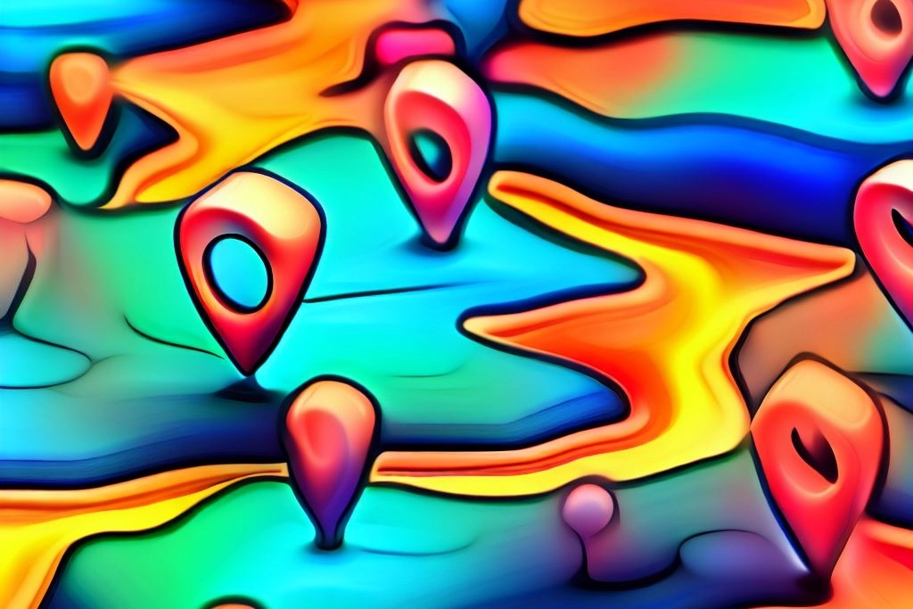
Geospatial heat maps proffer a visually striking and informationally dense medium for the exploration of spatial data. These maps employ gradations of color to represent varying densities or values across a geographical canvas. The utility of this modality is particularly salient for businesses with localized or regionally distinct customer bases. Through the meticulous deployment of geospatial heat maps, organizations can glean invaluable insights into customer demographics, behavioral predilections, and spatial patterns. This enables more targeted marketing endeavors, efficient resource allocation, and optimized strategic planning.
While geospatial heat maps are invaluable, it is imperative to remember that they are not a panacea. They specialize in illuminating geographical and spatial relationships but are often less efficacious in elucidating other types of relationships or trends. Thus, they should be used as part of a diversified analytics strategy.
As businesses navigate the labyrinthine complexities of contemporary data landscapes, specialized tools like geospatial heat maps can serve as indispensable compasses, guiding them towards data-driven decisions and strategies. With a nuanced understanding of the various data visualization techniques at their disposal, organizations can employ these tools not merely as cosmetic enhancements but as integral components of their analytical arsenal. The judicious utilization of geospatial heat maps, therefore, stands as an exemplar of how specialized data visualization tools can provide businesses with tangible, actionable insights in a nuanced and context-specific manner.
Tyrone ShowersMove from reporting to action with predictive analytics consulting, connect it to the Business Momentum System, or book an analytics consult.
Want this fixed on your site?
Tell us your URL and what feels slow. We’ll point to the first thing to fix.